Exhibition
Review by James R. Hugunin:
OSAYCANYOUSEE January 18
- March 30, 2008. Wright Museum of Art, Beloit College, Beloit, WI 53511.
A photographic installation by Lewis Koch.
On the shore, dimly seen thro'
the mists of the deep,
Where the foe's haughty host in dread silence reposes,
What is that which the breeze, o'er the towering steep,
As it fitfully blows, half conceals, half discloses?
-- Francis Scott Key
Excerpt from installation's wall text: Lewis Koch draws upon aspects of photography, sculpture, assemblage, text, and musical accompaniment with which he calls attention to the often unremarked upon elements of everyday life. In this exhibition, he weaves a subtle rhizomatic visual narrative that critiques the globalization of conflict and endless war. As an artist-in-residence at Copenhagen's Fotografisk Center, Koch created the web project Touchless Automatic Wonder; located at http://www.photography.dk/online/Koch/00a.html, it provides an overview of his work prior to 2001. More recently, When Things Dream, the third installation in the artist's "Garage Trilogy," is shown on the web at http://www.afsnitp.dk/galleri/garageography/ as Garageography 3.0.7.
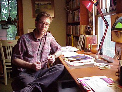
Lewis Koch at his studio,
Madison, WI (photo by James Hugunin)
An Uncanny Apparition, A Dialogue
A: It's like looking at a body in pieces. Deterritorizialing the flows of the dominant imperialist discourse of . . .
B: Yes. Human body and social body. War tears apart flesh and societies. People and cities in ruins. The fragments of places and artifacts inside the images and the images as fragments of some larger whole that we, the viewers, have to fit into our own interpretation. Moreover, these images have appeared in other contexts in Koch's work; he recycles these fragments, uses them like words that can be assembled along both the horizontal chain of syntagmatic association of spatial propinquity and along the vertical chain of metaphoric substitution. Stand back here and look at his installation. Notice both the horizontal and vertical emphasis in the space.
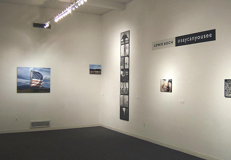
Installation view: Wright
Museum of Art, Beloit, WI (archival inkjet prints and gelatin silver prints)
A: True! It recalls John Baldessari's bare bones use of horizontal / vertical substitution in his various works, like his artist book, Fable, but Koch pulls apart the images and text and places them in suggestive and unstable relationships.
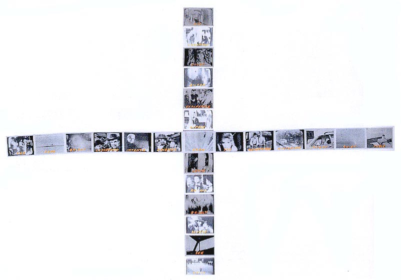
A Sentence in 13 Parts
(with 12 alternative verbs) Ending in FABLE (artist's book, 1977) John
Baldessari
(mouse-over to see image showing how easily Baldessari's array can become
similar to Koch's wall installation)
A: His work consistently deterritorializes and reterritorializes his own photographic production, creating new networks for his body of imagery. Yes, quite open to various interpretations. Not at all like the tendentious revolutionary imagery from the early days of the Soviet Union and The People's Republic of China that are on display in the other gallery here. By the way, the ambient music -- very uniform, repetitious, melancholic -- is like an aural frame, holding all these diverse visual fragment together. A sort of funeral dirge.
B: Yes. Henryk Górecki's Third Symphony, a symphony of sorrowful songs; the first movement contains a 15th-century Polish prayer, the Holy Cross Lament and a prayer inscribed on wall 3 of cell no. 3 in the basement of the Gestapo headquarters in Zakopane, Poland by an eighteen-year old girl. Thus the composer connects serious music with the serious, sad events of recent history. Just as Koch connects the past with present in his image juxtapositions.
A: Appropriately, the CD cover is a reproduction of a detail of a photograph by American pictorialist Gertrude Käsebier, A Maiden at Prayer (1899).
B: Speaking of women . . hush . . . I want to listen . . . Dawn Upshaw's soprano voice is so haunting.
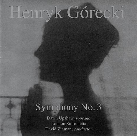
Symphony No.3, Opus
36 ("Symphony of Sorrowful Songs," 1976) by Henryk Gorecki /
Dawn Upshaw, soprano
(click CD cover to hear music accompanying the installation,
30 second download with cable)
A: While you're listening, I'm going to page through the little photobook that supplements the installation.
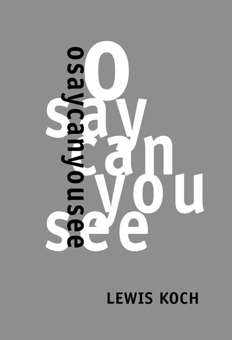
osaycanyousee (photobook
accompanying exhibition, 7.5 x 5.25 in.)
(click cover for video of this book, including ambient music, 75 second download
with cable)
B: That book is similar to the online version I recently perused in preparation for this show.
A: Yes, it's very thoughtful to have something you can take away with you from the show; one can peruse the images at one's leisure.
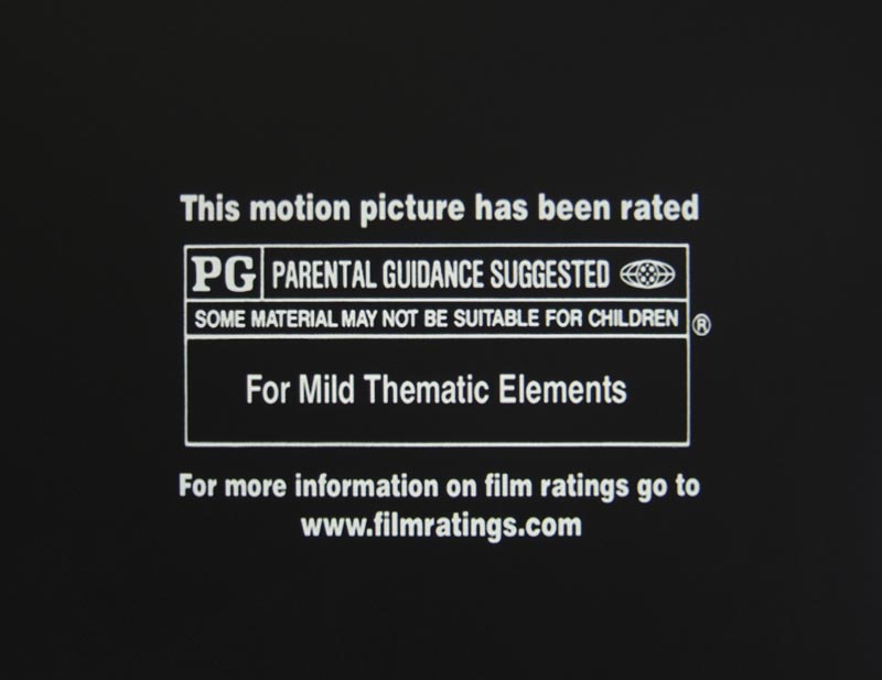
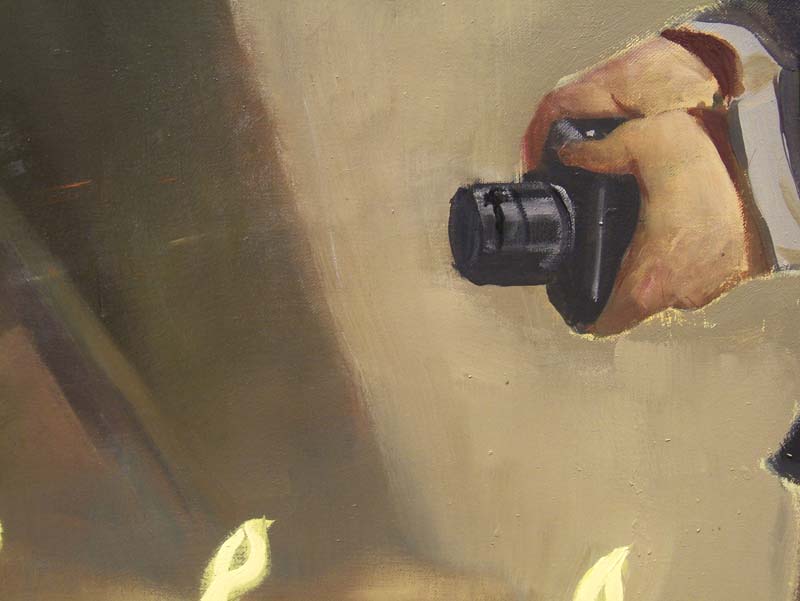
B: Just as Koch himself takes from a variety of sources. Notice four images-of-images: a detail of an Assyrian wall relief, a small fragment of a Neo Rauch painting, a very surprising film rating for the movie An Inconvenient Truth, and a graffiti-violated ad seen while traveling New York City's Subway.
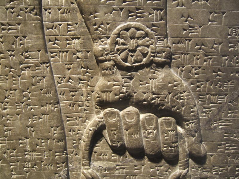
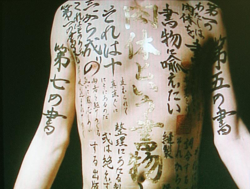
Assyrian wall relief
detail, Brooklyn Museum of Art (8
x 10 in., 2008) miiiiiFilm still
from Peter Greenaway's film Pillow Book
i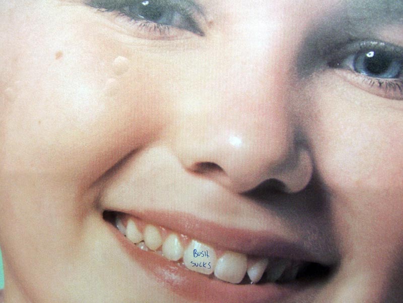
New York City (courtesy
NYC Metro)
(inkjet print,
12 x 16 in., 2007)
A: Yes, I see the front tooth on the smiling girl where someone has perversely penned in "Bush sucks."
B: People rewrite your identity on your skin . . . or on your teeth!
A: Only a blister in the upper left in the paper of the ad itself gives away the fact it's an image-of-an-image. Such a violation is a consciously oppositional art form that subverts the ersatz ad-smile optimism of the original image. Koch ups the violation ante by photographically appropriating the "turned" image and juxtaposing it to other fragments, underscoring the anti-war cast of the installation.
 i
i
An Inconvenient
Truth rating
(inkjet print, 8 x 10 in., 2007)
iiiiiiiiiiiiiiiiiiiiiiiiiiiiNeo Rauch painting
(detail) (inkjet print, 12 x 16 in., 2007)iii
B: I agree. Notice the Assyrian detail is lifted from a large and important relief in the collection of the Brooklyn Museum of Art. It keys us into Koch's interest in complex relationships between image and text, which here covers a body. The body as written. I can't help recall Peter Greenaway's film Pillow Book. Also, must I remind you that Assyrian civilization was centered in the area that is now Baghdad, Iraq, so Koch is making us think about the historical past of this region and its current state, a circular relationship, maybe.
A: That's right! Say, speaking of circles, doesn't that circular item on the wrist of that Assyrian look like a watch? The hand of time, sans the hands!
B: That "watch" looks like a "flower watch," a hippy's time-piece, or time-peace, or time-for-peace, to make a pun.
A: Ahhhh. But this could also be a reference to the warrior then and now in Iraq, the persistence of conflict in that area of the world. Now notice that the print of the detail of the Neo Rauch painting, the hand holding a camera, is placed near that shot made at the Denver Airport, so that the two images are made to resonate with issues of our panoptic society's will-to-surveille.
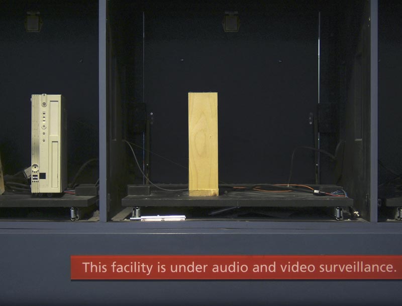
Denver Airport
(inkjet print, 9 x 12 in., 2007)
B: Moreover, that artist's name, Neo Rauch, translates as "new smoke." Maybe the smoke of explosions or "smoke 'n mirrors" -- the effects of power and media -- was something Koch had in mind here when he chose this artist's work. For sure, there is a hall-of-mirrors aspect to Koch's camera photographing another camera in the act of taking a picture.
A: Unlimited semiosis, play of the signifier, the scene of the abyss, our immersion in a forest of signs. Yes, I see your point. The way Koch has arrayed the images across the wall, well, I can't help but think of a picture magazine layout in which all the text has been erased so that one must now re-imagine new text to surround them, generate one's own reading. In fact, one group of images is titled Readings.
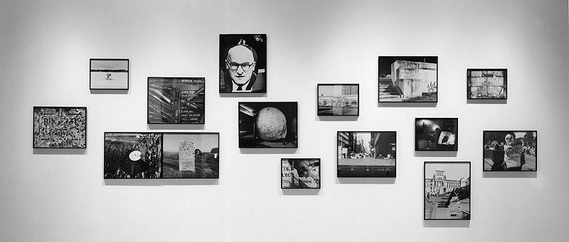
Installation view: Readings:
I (World of War) (58 x 163 in. overall, revised 2004)
B: Speaking of image sequences and interpretation, Minor White was known for his practice of sequences photographs and his theory of reading photographs. He'd interrogate the photograph based on what one knew, felt, sensed, associated with, and understood about, the image. This meant each viewer would construct a reading based on personal experience, cultural context, and historical time period. Like White's, Koch's clustered images are rhizomatic burrows through which desire moves like a guerrila fighter, ready to spring up when least expected.
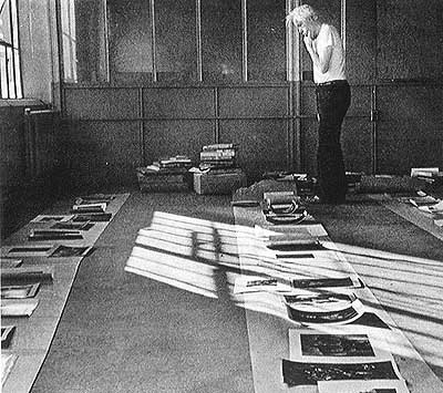
Minor White Sequencing
Photographs
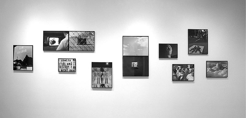
Installation view: osaycanyousee
(46 x 156 in. overall, 2004)
A: And I'm reminded of Nathan Lyons' groundbreaking photobook Notations in Passing (1974) with its photographic probing of the strangeness of the commonplace. Koch extends Lyons' work into more highly focused emphases here on the context of post-9/11 America.
B: Lyon, my friend, has done a project titled After 9/11 and some of the images from that 2005 exhibition can be interestingly compared to one of Koch's.
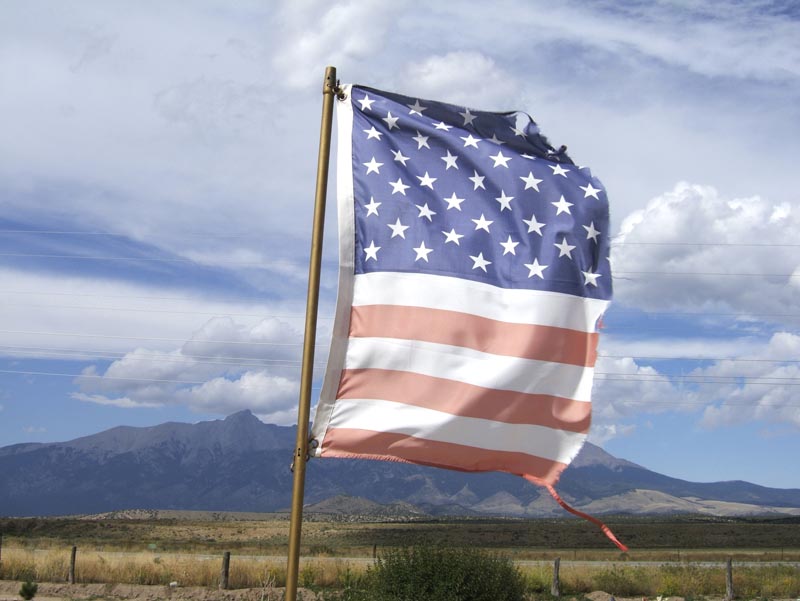
Near Alamosa, Colorado
(inkjet print,
31 x 40 in., 2007)
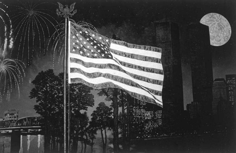
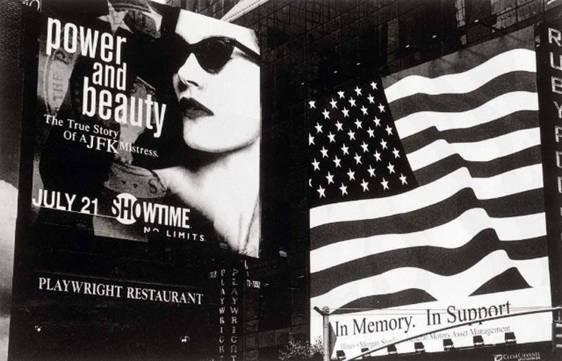
From After 9/11 (2005)
Nathan Lyons mmmmmmmmmmmmmmmmmmmFrom
After 9/11 (2005) Nathan Lyons
A: Of course, there is a long engagement with our flag as symbol, from Walter Evans, through Robert Frank, Garry Winogrand, Lee Friedlander and on and on.
B: One of Lyons' prints, in black and white, seems patriotic compared to both Frank's treatment of it in the photobook, The Americans (1959), and to Koch's remarkable color shot of a flag torn perfectly in half.
A: Torn in half like our Country, into Red versus Blue states.
B: Surprising that Koch's rendition of our flag, luscious with color that one would expect to result in a more patriotic image, wholly subverts its positive qualities, and Lyons's monochromatic treatment, what has usually resulted in a more critical comment on patriotism, is celebratory. Another photo from Lyons's series is more ambiguous though, more akin to Frank's take on the American scene, what with the flag's juxtaposition to an ad for a Showtime special, "Power and Beauty," exploiting JFK's womanizing. Two aspects of our society are put into provocative tension here.
A: It's this latter mode of juxtaposition that Koch employs often. His two images, a diptych from the osaycanyousee sequence plays the same visual game of contrasting a powerful symbol with something that compromises it, but on a vertical dimension. I can't help but see the Statue of Liberty's raised arm as a power salute (recall the black atheletes so protesting at the Olympics in Mexico City) due to its contextual relationship with the TV image below, which looks like someone's being tortured.
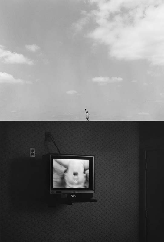
osaycanyousee (detail,
30 x 19 in., gelatin silver prints, 2004)
B: Oh yes, Koch has developed a penchant for vertical juxtapositioning effective in creating provocative associations both on a formal level and conceptually, just as Minor White did for horizontal arrays, in a series of stacked prints he calls Totems.
A: It's significant that Koch uses the term "totems" for it resonates with anthropological . . .
B: Oh yes, totem poles as representations of kin and tribal memories. Suggests hierarchies, false gods.
A: And we often say of something that it is "totemic" when it is venerated. Koch asks us to reconsider what we, as a society, venerate. War or peace? Straight talk or ideological obfuscation?
B: These photographs hover between knowledge and anti-knowledge. One minute you think you've figured it all out, the next you are scrambling again to find yet another meaning.
A: And that's why the show sustains our interest, I think. Nothing simple gels and thereafter remains understood. It's an open text that deconstructs "unhealthy" signs, only to reconstruct them as demythologized signs, "healthy" signs in Roland Barthes' sense of the concept. Each totem has a "head," a "body" of some vertical element, and a "foot." Rather than read the images as a sequence in time as a horizontal arrangement would suggest, the viewer initially perceives a gestalt, a figure. Then he or she starts to break down the totem into individual images, then strives to reconnect them again creating other possible meanings. Synthesis, analysis, new synthesis.
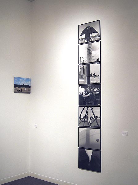
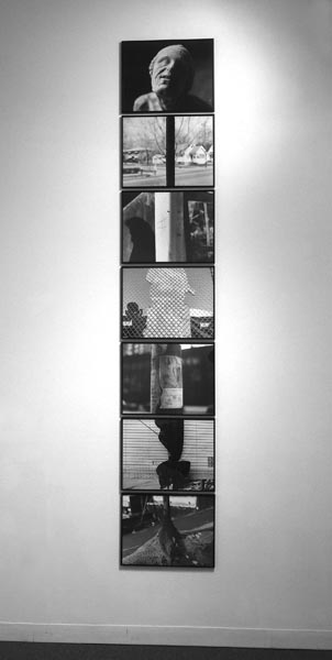
Installation view: Tangled
Web Totem (7 prints, 106 x 19 in. overall,1994)
mmmmmmmTar-Pit Totem (7 prints, 106 x 19 in. overall, 1994)
B: Hey, that's insightful. You surprise me.
A: The purported referent of a photo is never really its referent. That's why the photo is both knowledge and anti-knowledge. Why Koch's imagery never settles into dogma like too much political-oriented artmaking.
B: The point being that someone already said that about the referent. . . . Roland Barthes, right?
A: In the Beginning was the Word, thereafter, only the Quote.
B: That peculiar image of the World Trade Center Site . . .
A: Yah? What about it?
B: It exhibits what I've come to call "Kochness," that special quality of banality, intrigue, conundrum, composition and color that one recognizes as characteristic of Koch's imagery after seeing a large enough sample of his work.
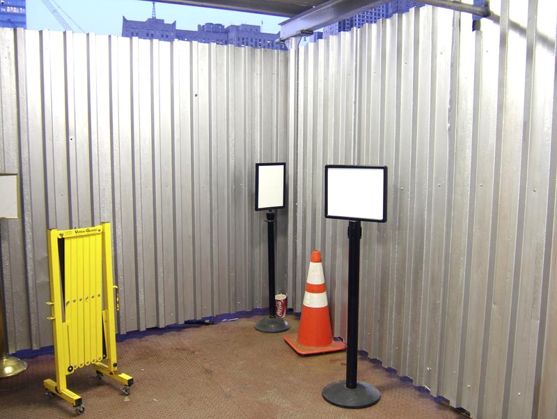
World Trade Center
Site, NYC (inkjet
print, 12 x 16 in., 2007)
A: The scene recorded in that image recalls a variety of installation work and fabricated-to-be-photographed work that have been increasing explored by artists since the 1970s. For instance, as an example of the latter mode of working, I recall Michael Levine's "Wild Walls and Roll-Aways" series accomplished when this artist was residing in Los Angeles in the early 1980s. Red Pitch at Mirage, in particular, reminds me of Koch's view here.
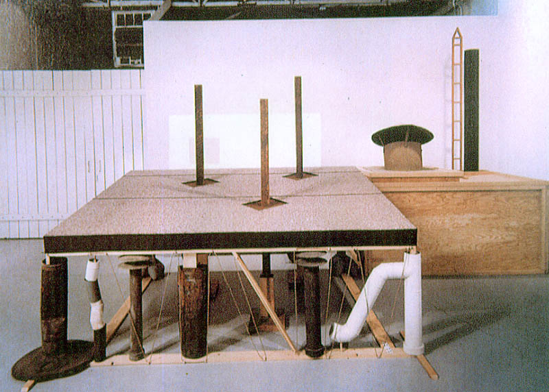
Red Pitch at Mirage
(16 x 20 in.
Type C print, 1981) Michael Levine
B: Nice observation! Yes, Levine's construction-to-be-photographed . . .
A: Set up in his downtown L.A. studio, photographed on four-by-five negative film, then disassembled.
B: Yes, both images present a visual enigma, one literally constructed, one found and enhanced-in-frame by Koch's keen eye. Just look at that image of Koch's! What the hell is going on? Blank signs, a yellow folding barrier, a metallic wall, a red cone that might be worn by a dunce. Some event is obscurely revealed recalling how cloaked in mystery, obfuscated, are the Bush Administration's behind-the-scene machinations.
A: But that image -- the site looks like a Levine installation-in-progress -- is also a self-reflexive metaphor for the exhibition itself and for the challenge of constructing meaning from the show's diverse fragments.
B: Within the scene depicted are red, white and blue colors which suggest patriotism, the yellow caution or cowardice, and the Coca Cola can crammed in the corner is a part that stands in for our whole consumer-desire nexus. These items have somehow come to reside at a site which we would never imagine as Koch has recorded it.
A: As a depiction of that hallowed site, it simultaneously tells us everything and nothing.
B: You know, that's just what I feel about the image, San Francisco, uncharacteristically displayed, shoved into the corner between the large image of the American flag we discussed earlier and the Tangled Web Totem. It's odd placement suggests Koch wants to generate a conceptual push-pull for that image battled out between two flanking pieces which enhances the tangled web of possible associations the viewer can make among them.
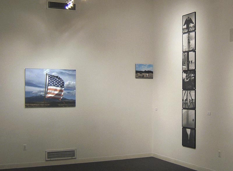
A: As you say, the placement of the smaller color print in the corner grates on your "gallery-eye," your habitual perception of what constitutes proper hanging conventions.
B: Yes. It's a purposeful tactic that enhances that image's undecidability. I mean what the hell is happening on that beach? That man in white will forever remain closing the distance between him and the veiled woman. Is she his wife? Is he even going to meet her? Is this a symbolic meeting of East and West? Notice that the veiled woman carries a contemporary purse! Does she constitute a threat or an overcoming of our suspicions?
A: If a threat, nobody seems concerned here. I read her placement there as more hopeful, reconciliatory. Like The Blessed Virgin appearing to peasants. By the way, I just flashed on how similar this image is to the many photographs we've seen in our photographic careers (some by Robert Frank) but with a difference: now an Islamic-looking woman, the signifier of Otherness in our Terroristic Times, appears like an uncanny apparition on our shores.
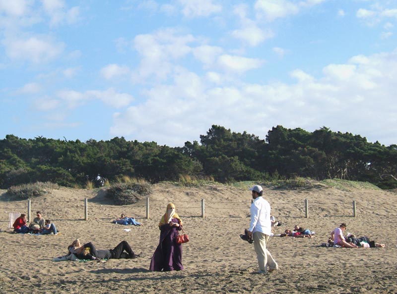
San Francisco (inkjet
print, 13 x 18 in., 2007)
B: Yet those sunbathers aren't phased a bit!
A: Unlike the neo-cons in Troy, New York's Rensselaer Polytechnic Institute who in March 2008 censored Chicago artist Wafaa Bilal's spoof of anti-Saddam video games in his exhibit titled “Virtual Jihadi,” which aimed to communicate the complexities of the ongoing conflict in Iraq. The artist was inspired by a popular American video game called “Quest for Saddam” in which the player hunts down and fights stereotypical Iraqi foes. Islamic extremists later rewrote this game so that players hunted down U.S President George W. Bush. I pulled an image off the RPI College Republicans website and found it to be, ironically, similar to a photograph in Tim Davis's My Life in Politics (2006).
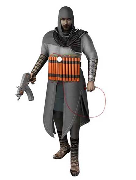
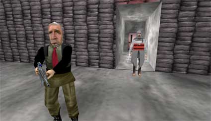
Virtual
Jihadi (2007)
Wafaa Bilal
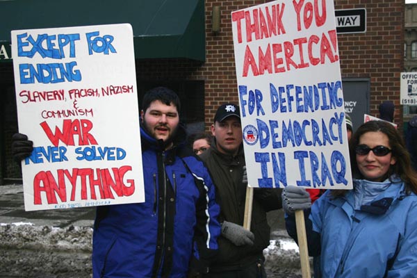
Rensselaer Polytechnic
Institute Neo-Cons on Parade in "Operation Blue Fury" (2005)
anonymousmmimmm
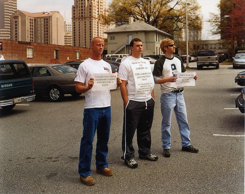
Counterprotestors
(n.d.) Tim Davis
B: Similar images, different contexts. On the RPI College Republican website, the protest image reads as supporting Bush war policies. Situated within Davis's book, his image encourages a negative reading of such protestors (witness his biting commentary on this image in the back of the book).
A: It also depends on the ideological bias of the viewer as to how such imagery is deciphered. But let's turn back to Bilal co-optation of that video game; he inserted himself digitally into the game as the “virtual jihadi” in order to point out the racism of the original game. Bilal, whose brother was accidently killed in the Iraq war by American shrapnel, said "Virtual Jihadi" is meant to bring attention to the vulnerability of Iraqi civilians to the travesties of the current war and racist generalizations and stereotypes as exhibited in games such as "Quest for Saddam."
B: Despite the importance of the issues Bilal is probing, despite my sympathy for his political position, I feel that his strategy is flawed.
A: How so?
B: Like Dread Scott's (formerly Dread Scott Tyler) infamous 1989 installation "What's the Proper Way to Display the U.S. Flag?" at The School of the Art Institute of Chicago, Bilal provoked people and turned them off; polarized them. What's the use of such activist art if you are only preaching to the converted and antagonizing those you should be getting on your side. I think Koch's approach (like Lorna Simpson's feminist artwork) is more subtle, demands more engagement by the viewer. It doesn't channel people into knee-jerk responses. These artists actually assume that people who may not be initially sympathetic to their ideological positions just may find themselves being enlightened and, hence, change their minds.
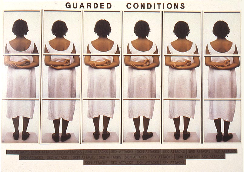
Guarded Conditions
(1989) Lorna Simpson
A: I agree. Koch (along with Simpson and others) makes me feel like they he isn't talking down to me, but respects my intelligence. Instead of Bilal's canny, strident voice, we have here in Koch's installation, as I've said before, "an uncanny apparition on our shores."
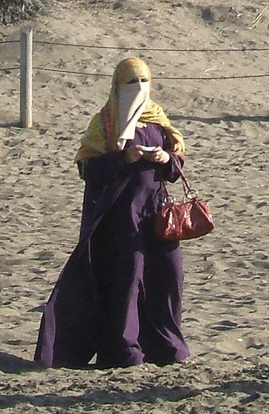
Detail from San Francisco
B: Now Koch has you quoting yourself! By the way, why does this image seem to me key to the installation?.
-- End --
James Hugunin teaches Photographic History and Critical Theory at The School of the Art Institute and is the Managing Editor of U-Turn E-zine